Converting images into time series for data mining
The first step in data mining images is to create a distance measure for two images. In the intro to data mining images, we called this distance measure the “black box.” This post will cover how to create distance measures based on time series analysis. This technique is great for comparing objects with a constant, rigid shape. For example, it will work well on classifying images of skulls, but not on images of people. Skulls always have the same shape, whereas a person might be walking, standing, sitting, or curled into a ball. By the end of this post, you should understand how to compare these hominid skulls from UC Riverside [1] using radial scanning and dynamic time warping.
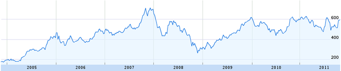
But first, we must start from the beginning. What exactly is a times series? Anything that can be plotted on a line graph. For example, the price of Google stock is a time series:
As you can imagine, time series have been studied extensively. Most scientists use them at some point in their careers. Unsurprisingly, they have developed many techniques for analyzing them. If we can convert our images into time series, then all these tools become available to us. Therefore, the time series distance measure has two steps:
STEP 1: Convert the images into a time series
STEP 2: Find the distance between two images by finding the distance between their time series
We have our choice of several algorithms for each step. In the rest of this post, we will look at two algorithms for converting images into time series: radial scanning and linear scanning. Then, we will look at two algorithms for measuring the distance between time series: Euclidean distance and dynamic time warping. We will conclude by looking at the types of problems time series analysis handles best and worst.
STEP 1A: Creating a time series by radial scanning
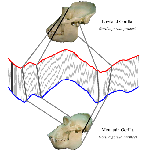
Radial scanning is tricky to explain, but once it clicks you’ll realize that it is both simple and elegant. Here’s an example from a human skull:

First we find the skull’s outline. Then we find the distance from the center of the skull to each point on the skull’s outline (B). Finally, we plot those distances as a time series (C). The lines connecting the skull to the graph show where that point on the skull maps to the time series below. In this case, we started at the skull’s mouth and went clockwise.
Skulls from different species produce different time series:
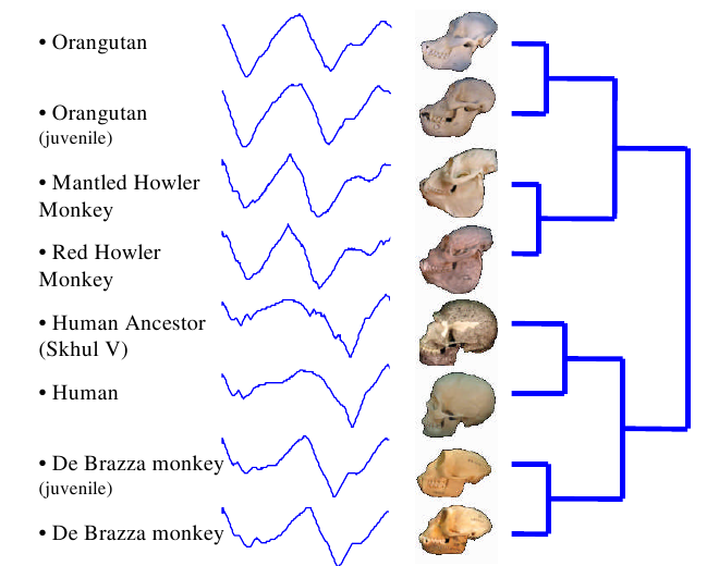
Take a careful look at these skulls and their time series. Make sure you can spot the differences in the time series between each grouping. Don’t worry yet about how the groupings were made. Right now, just get a feel for how a shape can be converted into a time series.
Another example of radial scanning comes from Korea University. Here we are trying to determine a tree’s species based on it’s leaf shapes:

The labeled points on the leaf at left correspond to the labeled positions on the time series at right. Radial scanning is a popular technique for leaf classification because every species of plant has a characteristic leaf shape. Each leaf will be unique, but the pattern of peaks and valleys in the resulting time series should be similar if the species of plant is the same.
We can already tell that the graphs created by the skulls and the leaf look very different to the human eye. This is a good sign that radial scanning captures important information about the objects shape that we will be able to use in the comparison step.
STEP 1B: Creating a time series by linear scanning
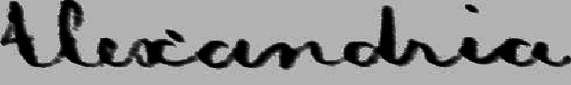
Some objects just aren’t circular, so radial scanning makes no sense. One example is hand written words. The University of Massachusetts has analyzed a large collection of George Washington’s letters using the linear scanning method. [3] [4] In the first image is a picture of the word “Alexandria” as Washington actually wrote it:

Then, we remove the tilt from the image. All of Washington’s writing has a fairly constant tilt, so this process is easy to automate.
Finally, we create a time series from the word:
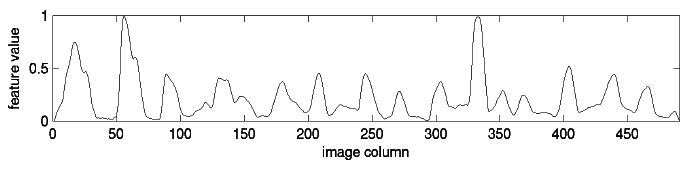
To create this time series, we start at the left of the image and consider each column of pixels in turn. The value at each “time” is just the number of dark pixels in that column. If you look closely at the time series, you should be able to tell where each bump corresponds to a specific letter. Some letters, like the “d” get two bumps in the time series because they have two areas with a high concentration of dark pixels.
We could have constructed the time series in other ways as well. For example, we could have counted the number of pixels from the top of the column to the first dark pixel. This would have created an outline of the top of the word. We simply have to consider our application carefully and decide which method will work the best.
We now have two simple methods for creating time series from images. These are the simplest and most common methods, but the only ones. WARP [5] and Beam Angle Statistics [6] are two examples of other methods. Which is best depends—as always—on the specific application. Now that we can create the time series, let’s figure out how to compare them.
STEP 2: Comparing the distances
The whole purpose of creating the time series was to create a distance measure that uses them. The easiest way to do this is the euclidean distance. (This is the normal $distance = $ that we are used to.) Consider the two time series below: [7]

More formally,
where \(red_i\) is the height of the red series at “time” \(i\), \(blue_i\) is the height of the blue series at “time” \(i\), and \(N\) is the length of the time series. This is a simple and fast calculation, running in time \(O(N)\).
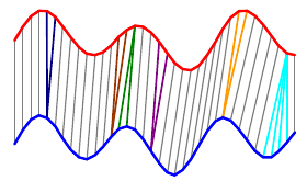
A more sophisticated way to compare time series is called Dynamic Time Warping (DTW). DTW tries to compare similar areas in each time series with each other. Here are the same two time series compared with DTW:

In this case, each of the humps in the blue series is matched with a hump in the red series, and all the flat areas are paired together. Notice that a single point in one time series can align with multiple points in the other. In this case, DTW gives a distance nearly zero—it is a nearly perfect match. Euclidean distance had a much worse match and would give a large distance.
For most applications, dynamic time warping outperforms straight Euclidean distance. Take a look at this dendrogram clustering:
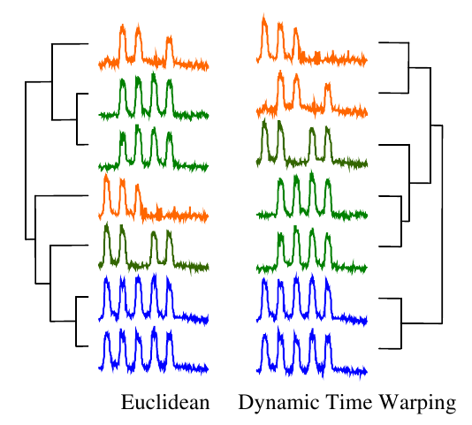
The orange series contain three humps, the green four, and the blue five. But the humps do not line up, so this is a difficult problem for straight Euclidean distance. In contrast, DTW successfully clustered the time series based on the number of humps they have.
That’s great, but how did DTW decide which points in the red and blue time series should align?
Exhaustive search. We try every possible alignment and pick the one that works best. This will be easier to see with a simpler example:
The overall distance is the distance between each \(red_i\) and \(blue_j\). This effectively compares every time in the red series with every other time in the blue series. Then, we select the path through the matrix that minimizes the total distance:
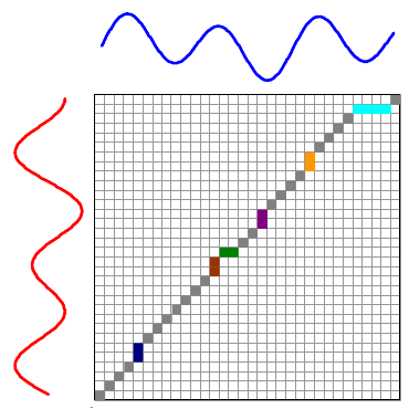
The colored boxes correspond to the colored lines connecting the two time series in the first image. For example, the four light blue squares in the top right are on a single row, so they map one point on the red series to four points on the blue one.
Using dynamic programming, DTW is an $O(N^2) $ algorithm, which is much slower than Euclidean distance’s \(O(N)\). This is a serious problem if we want to use the algorithm to search a large database.
The easiest way to speed up the algorithm is to calculate only a small fraction of the matrix. Intuitively, we want our warping path to stay relatively close to a diagonal line. If it stays exactly on the diagonal line, then every red and blue time correspond exactly. This is the same as the Euclidean distance. At the opposite extreme would be a path that follows the left most, then top most edges. In this case we are comparing the first blue value to all red values and the last red value to all blue values. This seems unlikely to make a good match.
There are two common ways to limit the number of calculations. First is the Sakoe-Chiba band:

The second method is the Itakura parallelogram:

The basic ideas behind these restrictions is pretty straightforward from their pictures. What isn’t straightforward, however, is that these techniques also increase DTW’s accuracy. [8] For over a decade researchers tried to find ways to increase the amount of the matrix they could search because they falsely believed that this would lead to more accurate results.
We can also speed up the calculation using an approximation function called a lower bound. A lower bound is computationally much cheaper than the full DTW function—a good one might run 1000 times faster than the time of the full DTW—and is always less than or equal to the real DTW. We can run the lower bound on millions of images, and only select the potentially closest matches to run the full DTW algorithm on. Two good lower bounds are LB_Improved [9] and LB_Keogh [10].
Finally, there are other methods for comparing time series. The most common is called Longest Common Sub-Sequence (LCSS). It is useful for matching images suffering from occlusion [11].
When to use Time Series Analysis
Time series analysis is only sensitive to an object’s shape. It is invariant to colors and internal features. These properties make time series analysis good for comparing rigid objects, such as skulls, leaves, and handwriting. These shapes do not change over time, so they will have similar time series no matter when they are measured.
Time series analysis will not work on objects that can change their shapes over time. People are good examples of this, because we have many different postures. We can walk, sit, or curl into a ball. Another distance measure called “shock graphs” is better for comparing the shapes of objects that can move. We’ll cover shock graphs in a later post.
references
[1] Eamonn Keogh, Li Wei, Xiaopeng Xi, Sang-Hee Lee and Michail Vlachos “LB_Keogh Supports Exact Indexing of Shapes under Rotation Invariance with Arbitrary Representations and Distance Measures.” VLDB 2006. (PDF)
[2] Yoon-Sik Tak and Eenjun Hwang. “A Leaf Image Retrieval Scheme Based on Partial Dynamic Warping and Two-Level Filtering” _7th International Conference on Computer and Information Technology, _2007. (Access on IEEE)
[3] Rath, Kane, Lehman, Partridge, and Manmatha. “Indexing for a Digital Library of George Washinton’s Manuscripts: A Study of Word Matching Techniques.” CIIR Technical Report. (PDF)
[4] ath, Manmatha. “Word Image Matching Using Dynamic Time Warping,” the Proceedings of CVPR-03 conference,vol. 2, pp. 521-527. (PDF)
[5] Bartolini, Ciaccia, Patella, “WARP: Accurate Retrieval of Shapes Using Phase of Fourier Descriptors and Time Warping Distance” _IEEE Transactions of Pattern Analysis and Machine Intelligence, _Vol 27 No 1, January 2005. (PDF)
[6] Arica, Yarman-vural. “BAS: a perceptual shape descriptor based on the beam angle statistics.” Pattern Recognition Letters 2003. (PDF)
[7] Keogh, “Exact Indexing of Dynamic Time Warping” (PDF)
[8] Ratanamahatana, Keogh. “Three Myths about Dynamic Time Warping.” SDM 2005. (PDF)
[9] Lemire, “Faster Retrieval with a Two-Pass Dynamic-Time-Warping Lower Bound,” Pattern Recognition 2008. (PDF)
[10] Keogh, Ratanamahatana. “Exact indexing of dynamic time warping,” Knowledge and Information Sytems 2002. (PDF)
[11] Yazdani, Meral Özsoyoglu. 1996 Sequence matching of images. In Proc. 8th Int. Conf. Sci. Stat. Database Manag. pp. 53–62.